 This may just be the No. 1 question I am asked regarding resumes. People seem to think that the length of a resume plays a key factor in whether or not the resume gets read.
But the reality is that resumes rarely get read, no matter how short or long they are. At least not in their entirety. The length of your resume is not what’s most important. What’s most important is the quality of the content.
Most hiring managers scan resumes, looking for specific content such as what your profession is, what your skills are, where you have worked (and for how long), your job titles and your educational level. They will be on the lookout for any unexplained employment gaps, excessive job hopping and disjointed career progress.
If the resume passes this initial scan, the hiring manager will look for your accomplishments in past positions and determine how closely aligned these successes are to their organization’s future success. If any of this information is difficult to quickly spot on your resume, the reader will probably stop reading very quickly — within seconds.
Some job seekers may be able to package all this information into a one-page resume. Others, particularly those with longer career histories or more frequent job changes, may need two pages. In the U.S. private-sector market, the recommendation is generally not to exceed two pages. If there is something that is truly an important part of your work history, you don’t want to have to wait until page three or later to reference it.
So how can you get the best quality information on just one or two pages? Here are some suggestions.
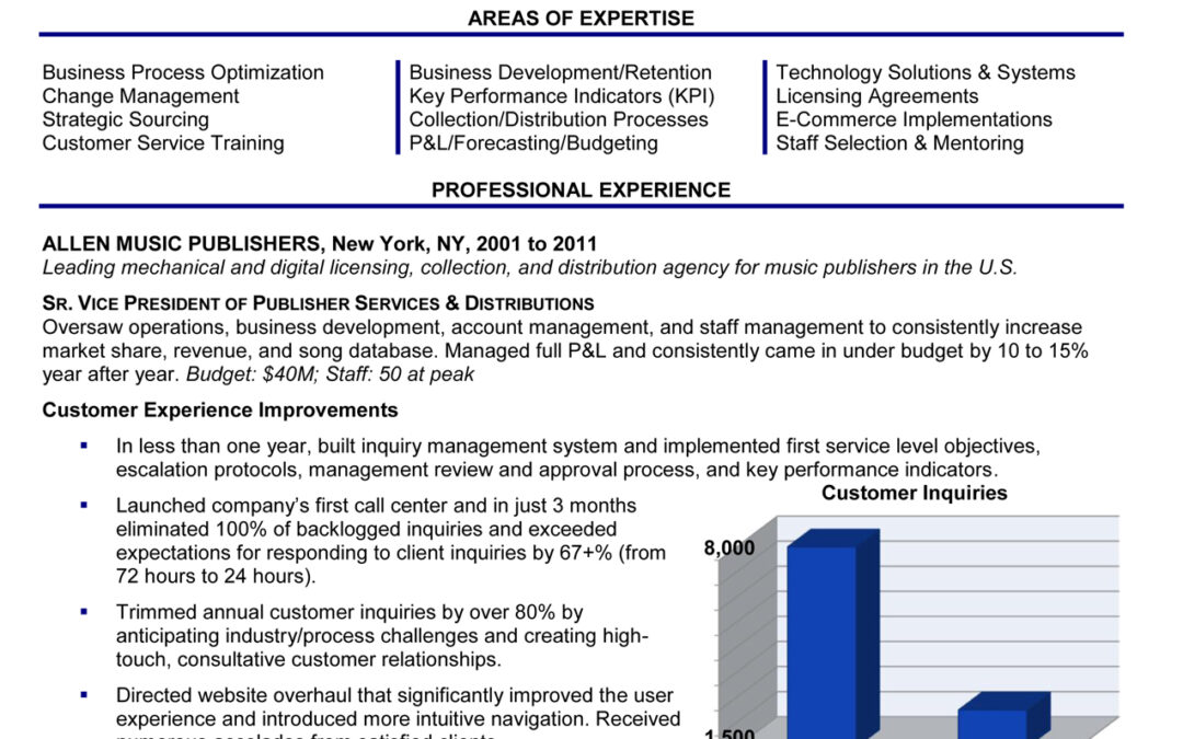
- Use space creatively. Create a resume with margins between .6 and 1.0 on all sides. This gives you flexibility with the way the content is laid out. Place dates of employment in a column on the right-hand margin, rather than the left, to eliminate wasted space. If you need more space on the page for content, consider laying out one of the other sections in a space saving way. For example, instead of centering your contact information at the top of the resume and wasting 5 lines, place your name on the first line and all your contact information in a row on the second line.
- Watch your font size. Font sizes of 10 or 11 generally work best on resumes. Using a smaller font can make the resume difficult to read. But if you need more space, select a font such as Ariel or Times New Roman, which both read quite well in 10 point font.
- Use bolding to call attention to important information. Consider placing company names, dates, and job titles in bold so they are easy for the reader to spot. You can also use bold to call out key performance metrics, industry awards and other distinctions.
- Edit and then edit again. Resume writing is a bit different from other forms of writing. Frequently words such as “a” and “the” can be omitted from the resume because these words are understood by the reader, and the meaning of the message is not compromised by removing them. Read each sentence in your resume and see if there is a way to communicate the same information using fewer words. Frequently in resume writing, less is more.
- Think horizontal instead of vertical. Rather than creating long lists of job skills, language skills, technical competencies, etc., considering placing this information in a horizontal chart to make better use of the space.
- Strive for balance. A one or two page resume can look great. A resume that is one page filled with text and just three lines on a second page looks odd — as if you’ve run out of things to say. Either prune or expand your content, margins, fonts, and spacing to get your resume down to a full one or two pages.


You are definitely right about having a second page and having very little on it. Keeping it at one page is certainly better than that.
Concisely and well put! Some of the tips landed right on point; they will most surely help to capitalize on bringing out the best of your candidacy’s traits in a resume to the employer
I’ve also been a follower of the cv-heaven.com , and at times they did deliver on-point tips about questions related to resume composition.